After I updated to iOS 15 on Monday, I decided to make my iPhone boring on purpose.
The problem was not any one app. It was not that I had one specific villain sitting on the home screen, cackling every time I unlocked the phone. The problem was the unlocked phone itself as a default invitation.
I noticed that I spent a lot of screen time in any given day staring at my apps and folders the same way you stand in front of the fridge, just looking for something to open. Not hungry. Not looking for anything specific. Just checking whether the future had placed something new behind the door since the last time I looked.
There are experts who have described versions of this more thoroughly than I can, but the practical thing I realized was simple: there are a limited number of apps I actually use regularly, and a much larger number of apps that mostly exist as suggestions to drift.
That is a bad default for an object I carry everywhere.
What changed
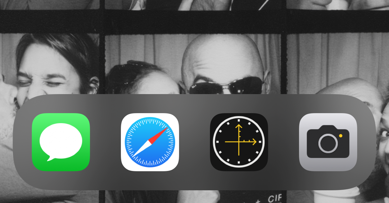
The experiment was very small. I removed everything from the iPhone home screen except four apps in the bottom bar:
- Messages
- Safari
- Where/When
- Camera
Everything else moved off the home screen. If I wanted another app, iOS could surface it through Siri Suggestions, Recently Added, the App Library categories, or search. I could still get to anything. The point was not to make the phone pure, or strict, or impressive in a screenshot. The point was to stop letting the first screen behave like a menu of temptations.
Four is not magic. It was just the number that matched the reasons I most often picked up the phone on purpose.
Why these four
Messages stayed because it is direct communication. Usually, if I open Messages, there is a person on the other end and some actual reason to be there. That does not make it noble. It just makes it less ambiguous than a folder full of little rectangles waiting to be checked.
Safari stayed because the web is still the general-purpose tool. It can absolutely become a distraction, but opening Safari feels different from tapping a row of apps that each already knows exactly which loop it wants to put me in. Safari asks me to start with an intention, even if the intention is only “look this thing up before I forget.”
Where/When stayed because it was one of the few apps on my phone that represented a specific personal job. I built it so I could keep a small, private location memory in my own calendar instead of depending on a platform that had drifted away from the thing I needed. Opening it means I am checking in somewhere because I may want to remember that place later. It is not a feed. It is closer to a tiny piece of personal infrastructure.
Camera stayed because it points away from the phone. That sounds slightly precious, but it is true. The Camera app is for capturing something in the world, not for consuming whatever the phone has prepared for me. It is one of the few default apps that usually makes the phone disappear after doing its job.
That was the whole bar: communication, web, memory, camera. Specific reasons to pick up the device.
Why it worked
The useful part was the speed bump.
I did not delete my distracting apps. I did not pretend Siri Suggestions would always guess perfectly. I did not become a better or more focused person because I moved icons around, which would be a deeply embarrassing thing to claim in public.
What changed was the first move after unlocking the phone. The home screen stopped advertising quite so much. If I had a task, I could do it. If I did not have a task, there was less there to convert vague restlessness into 20 minutes of app pinball.
This is the part that improved my relationship with the phone. General lingering was reduced because the phone had fewer visible invitations. Once the task was finished, it became easier to put the phone down until the next direct reason presented itself.
That sounds too small to matter, but small defaults train behavior. A home screen is not neutral. It is an attention surface. The more it offers, the more it asks to be scanned. The less it offers, the more the phone becomes a tool you use and leave alone.
The iPad version
Although I have 14 apps in the iPad dock instead of 4, this effect is even nicer when animated:
The iPad is a different object for me, so the same rule did not need to apply with the same severity. That is probably the better lesson anyway. The number is not the doctrine. The surface is the thing.
Looking back from now, I do not think the exact four-app setup is the important artifact. Maybe it changes. Maybe a different season of life deserves a different bottom bar. The part that survives is the idea that the first screen should answer a question before it creates one: why did I pick this up?
Sometimes the best interface is the one with less to offer.